


TEMPO


Team: Judith_Solé / Ruben_Barrera / Ruben_Montero / Beth_Pujol
Material: Glass / Sand
Country: Spain / Barcelona
Released: 2019
Genre: Product / Experimentation / Graphic
Artisan: Ferran_Collado
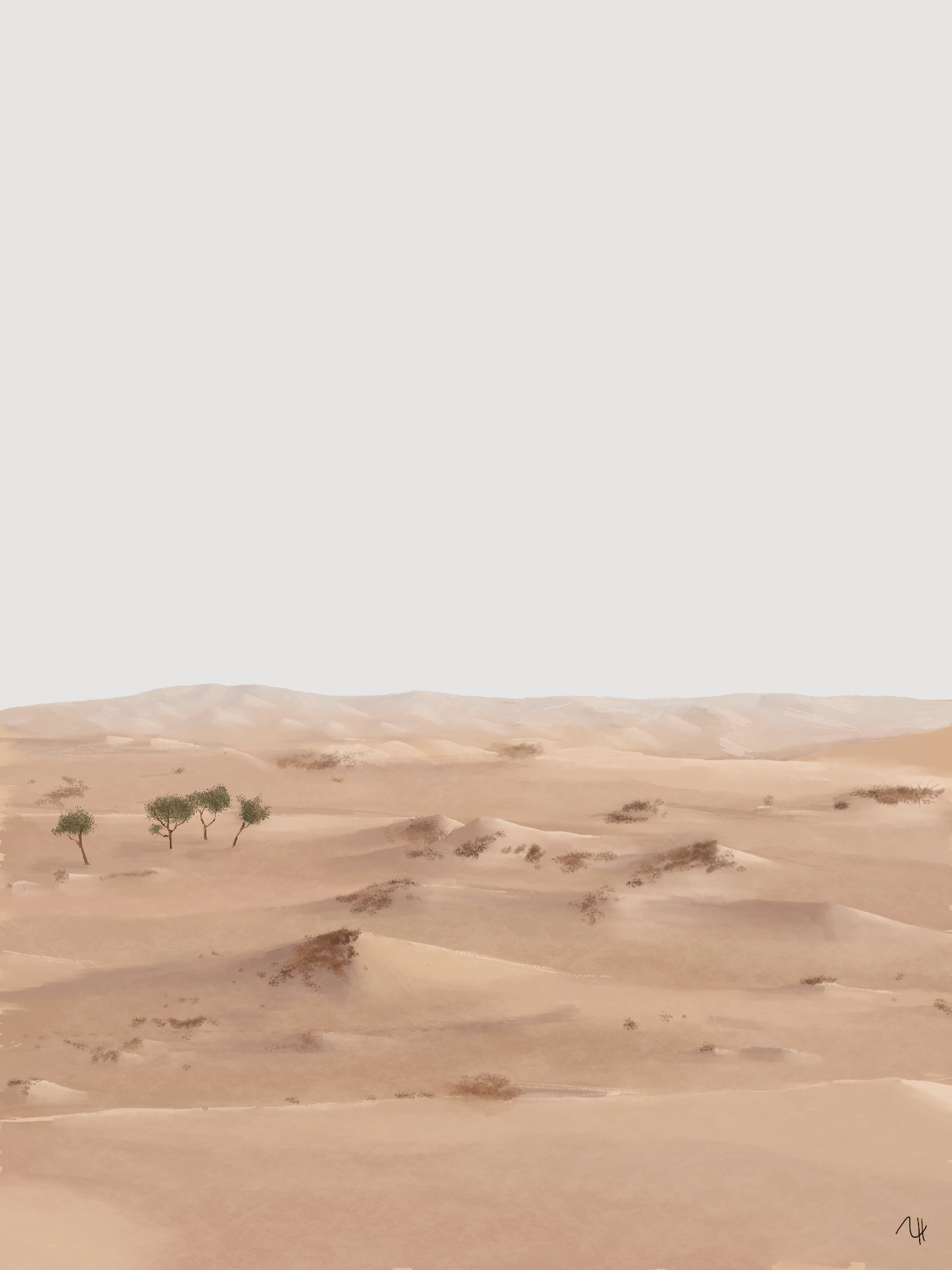
Tempo is a poem for the soul, an invitation to reflection.
In a society where time is no longer what it was, where it has become a straight millimeter line with no meaning or direction. Where an instant without action is interpreted as dead time. Where every thousandth of a second must be "taken advantage of."
Tempo grows out from
The waste of time
Generalizing the 21st-century human, we can determine that it is a busy being, with large doses of stress and apparently no time.
These people can determine that many things in their rutine are a waste of time but that’s just a perception.
BECAUSE WHAT IS A WASTE OF TIME?
We can not determine what is but with Tempo we wanna try to make people being aware of it.
We tend to assume that the more we work continued before we will finish, but without these lapses, the energy fades and makes us less productive.
TEMPO DOESN’T UNDERSTAND ABOUT NUMBERS. TIME IS WHAT IT IS AND THE ONLY THING WE CAN SAY IS THAT EVERYBODY HAS A PERSONAL PERCEPTION OF IT.
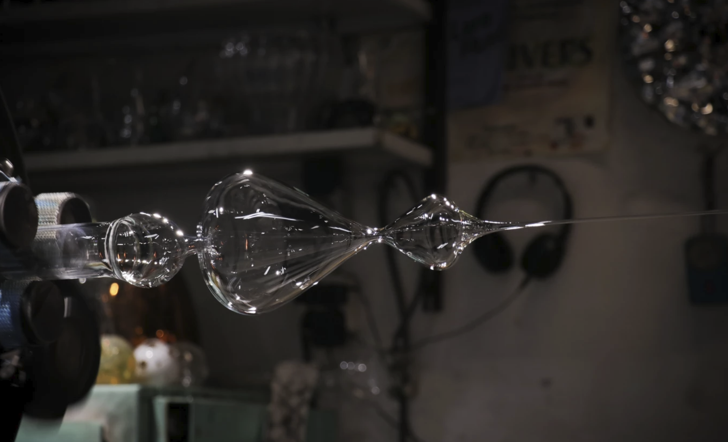
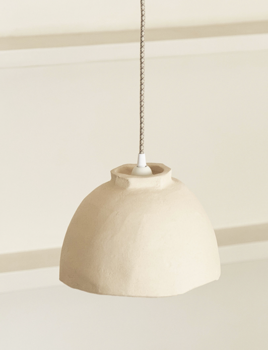
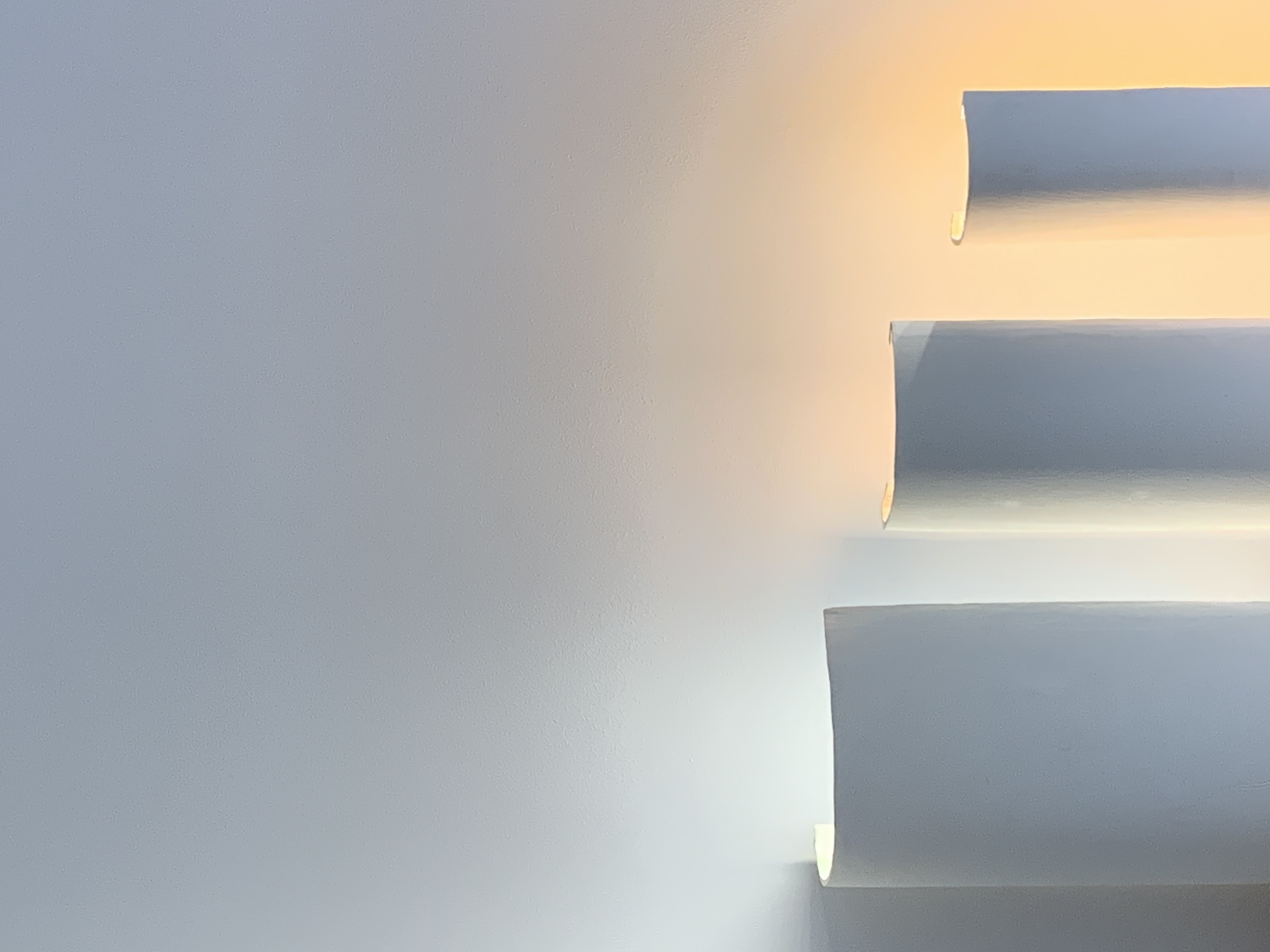
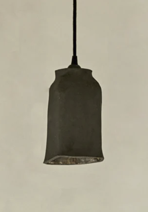
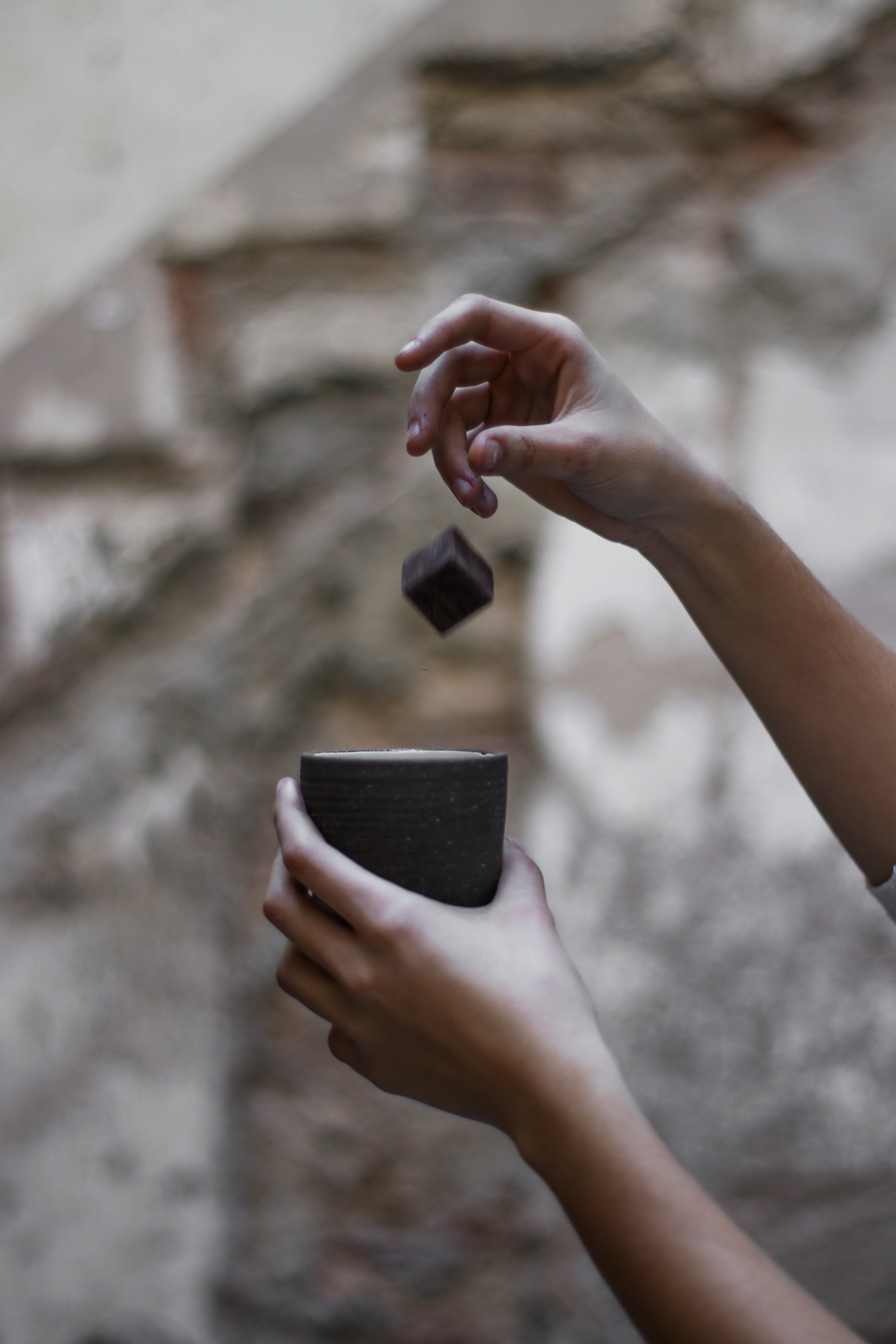
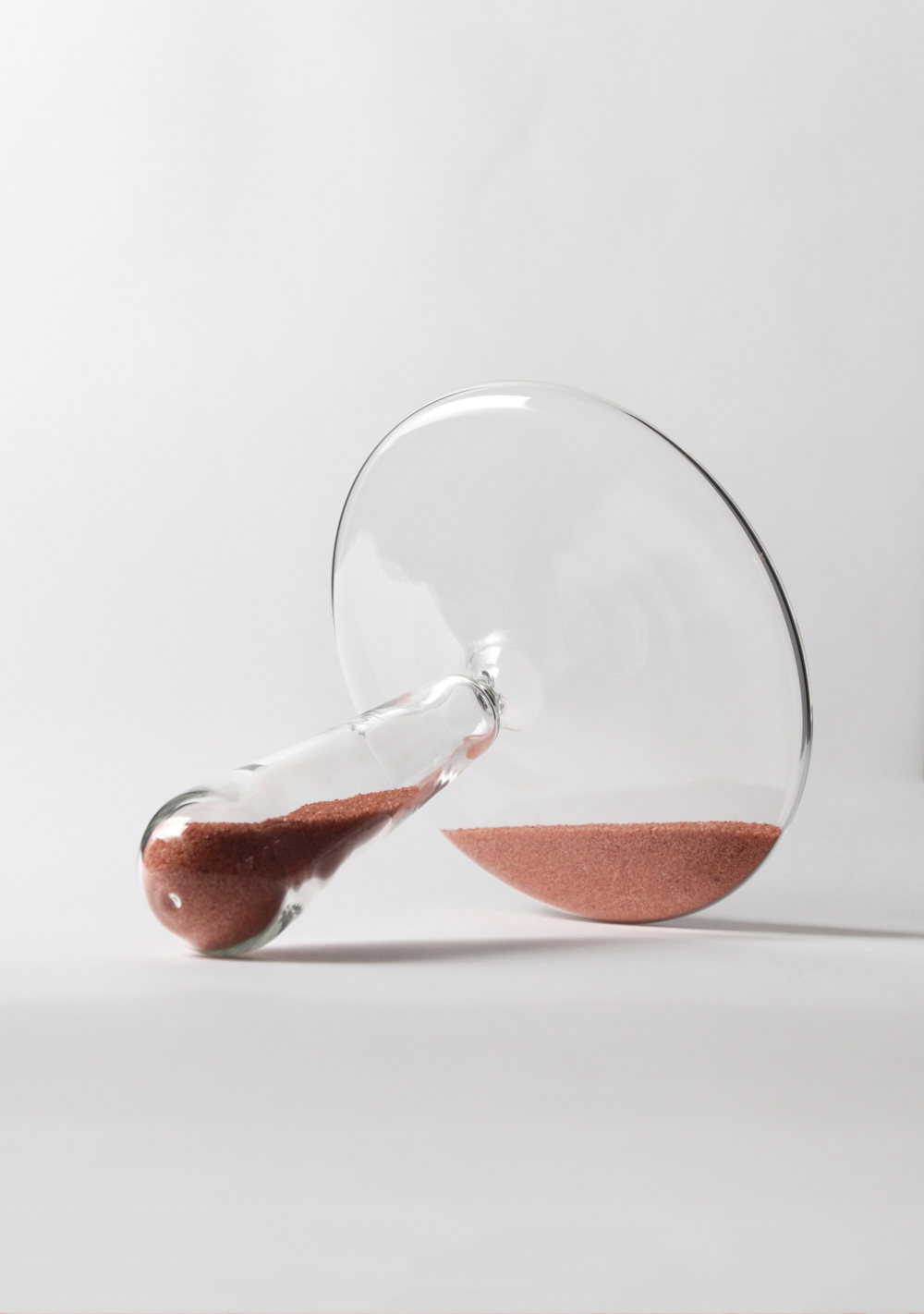
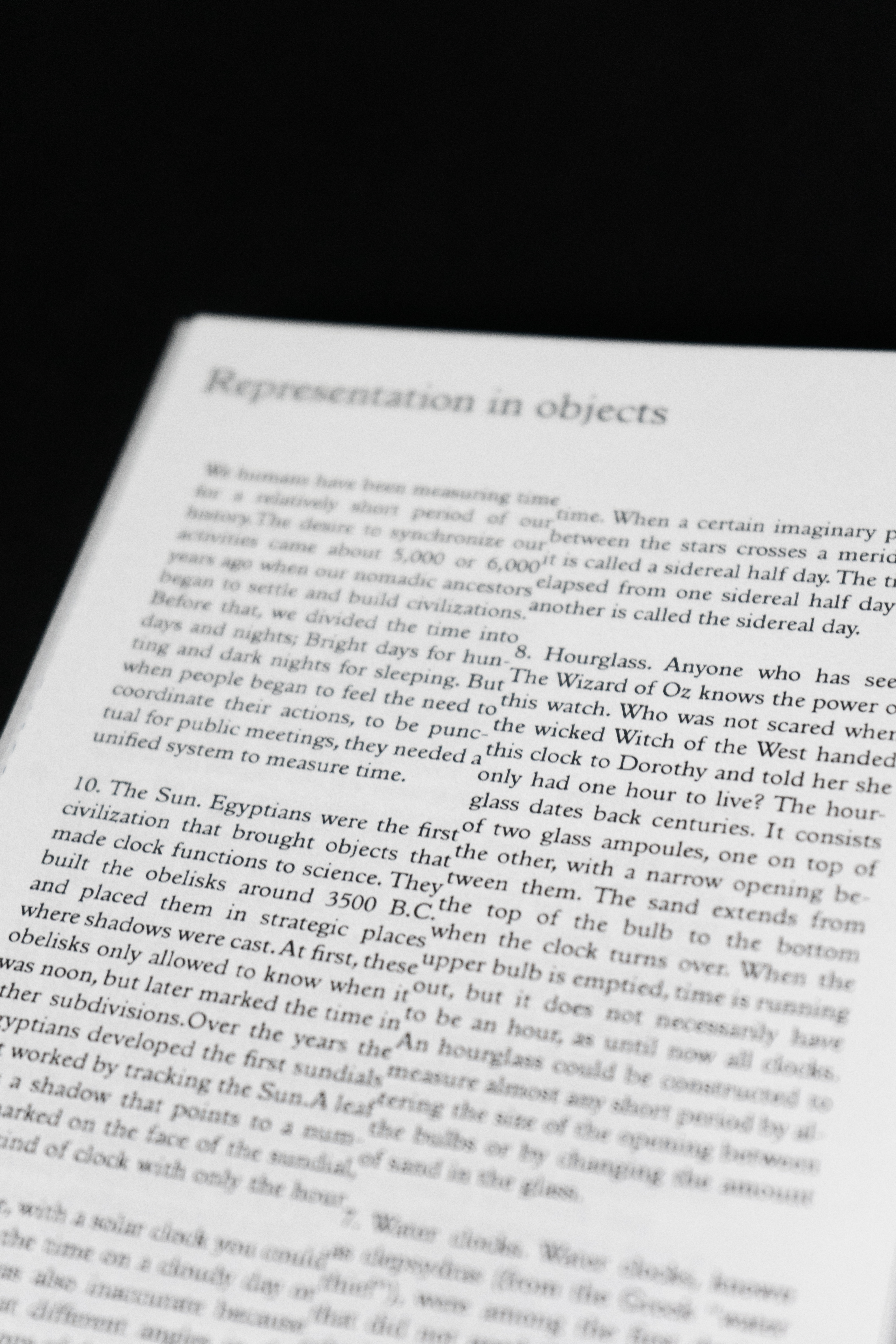
HOURGLASSES
Hourglasses
have been a way of measuring time for years and are
increasingly obsolete due to
the digital trend in society. It
is a material way of measuring time and visually ignores
numbers, so the perception of
matter takes on great relevance in these clocks. We are
used to recognize a clock with two equal
parts, more or less conical or cylindrical,
but always with two equal
parts where the sand goes
from one-winged to the other
when reversing its position.
Tempo breaks this IDEA
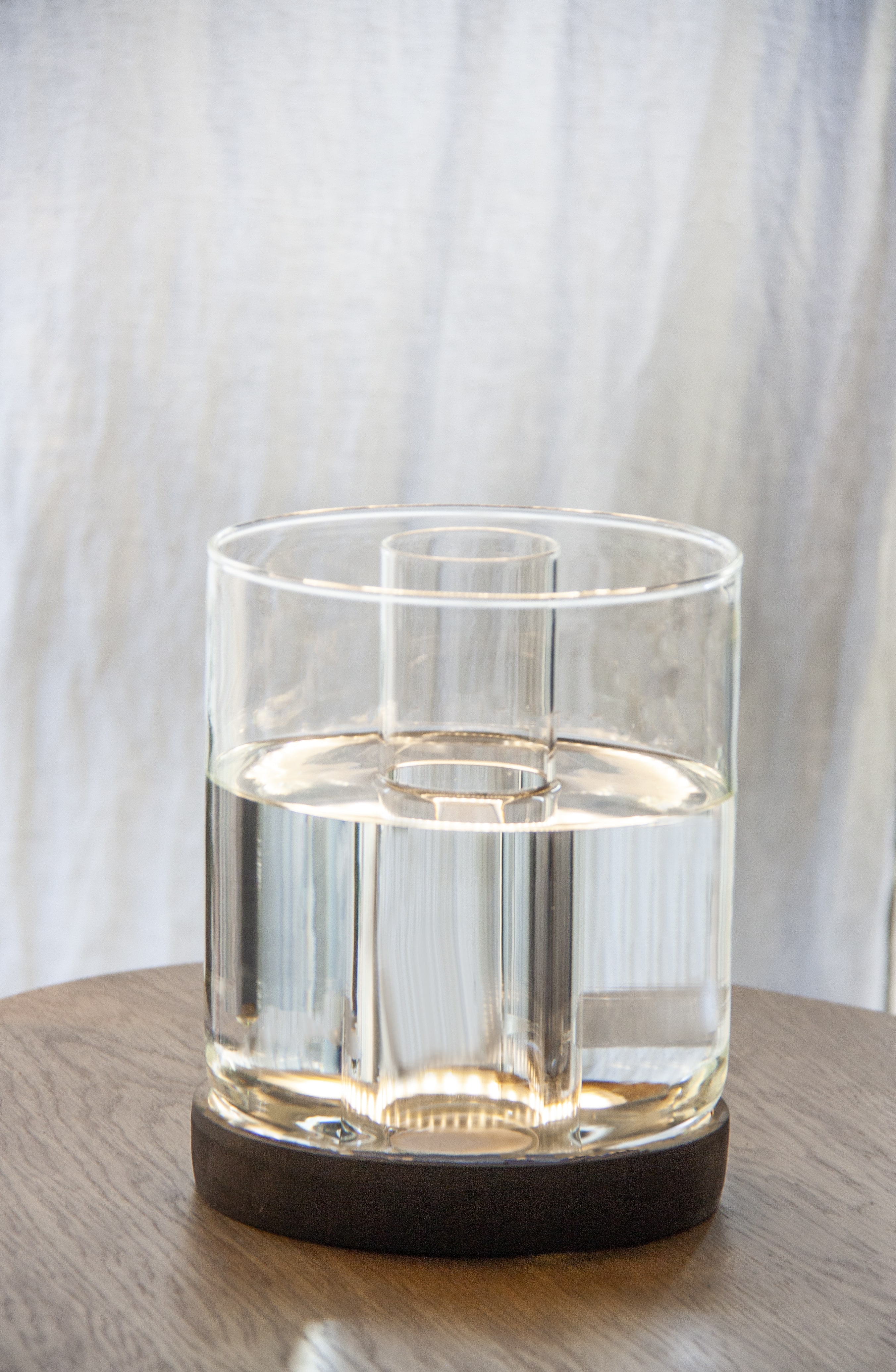
Apparently, we've designed a classic hourglasses that supposedly helps organize your time. But in fact what we offer is a reflection object about time, for aware everybody of their present lifes.
Our proposal in this peculiar collection of hourglasses is to make people aware of their time. Each hourglass counts the time in a different time it’s just something perceptive out of mathematics.
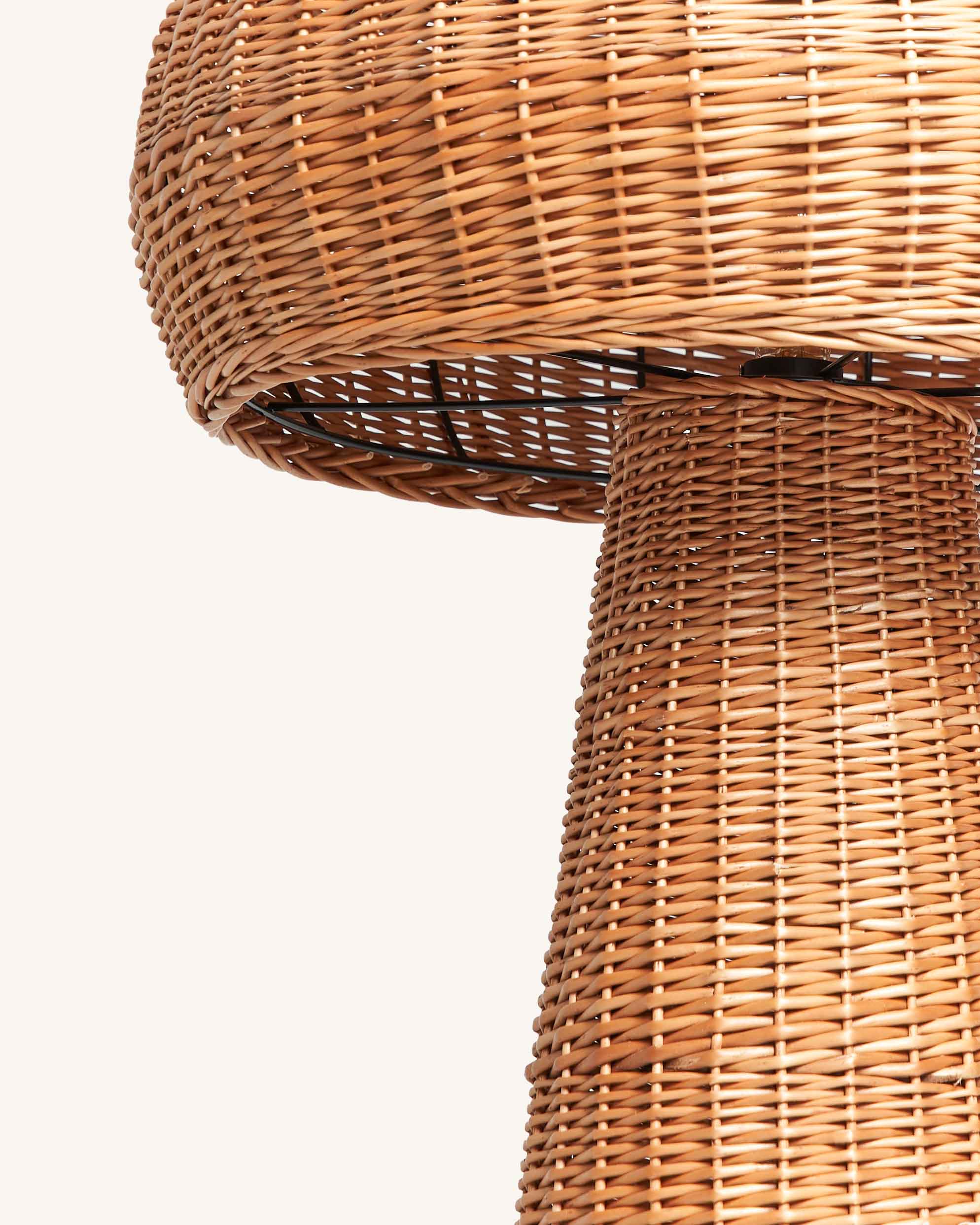
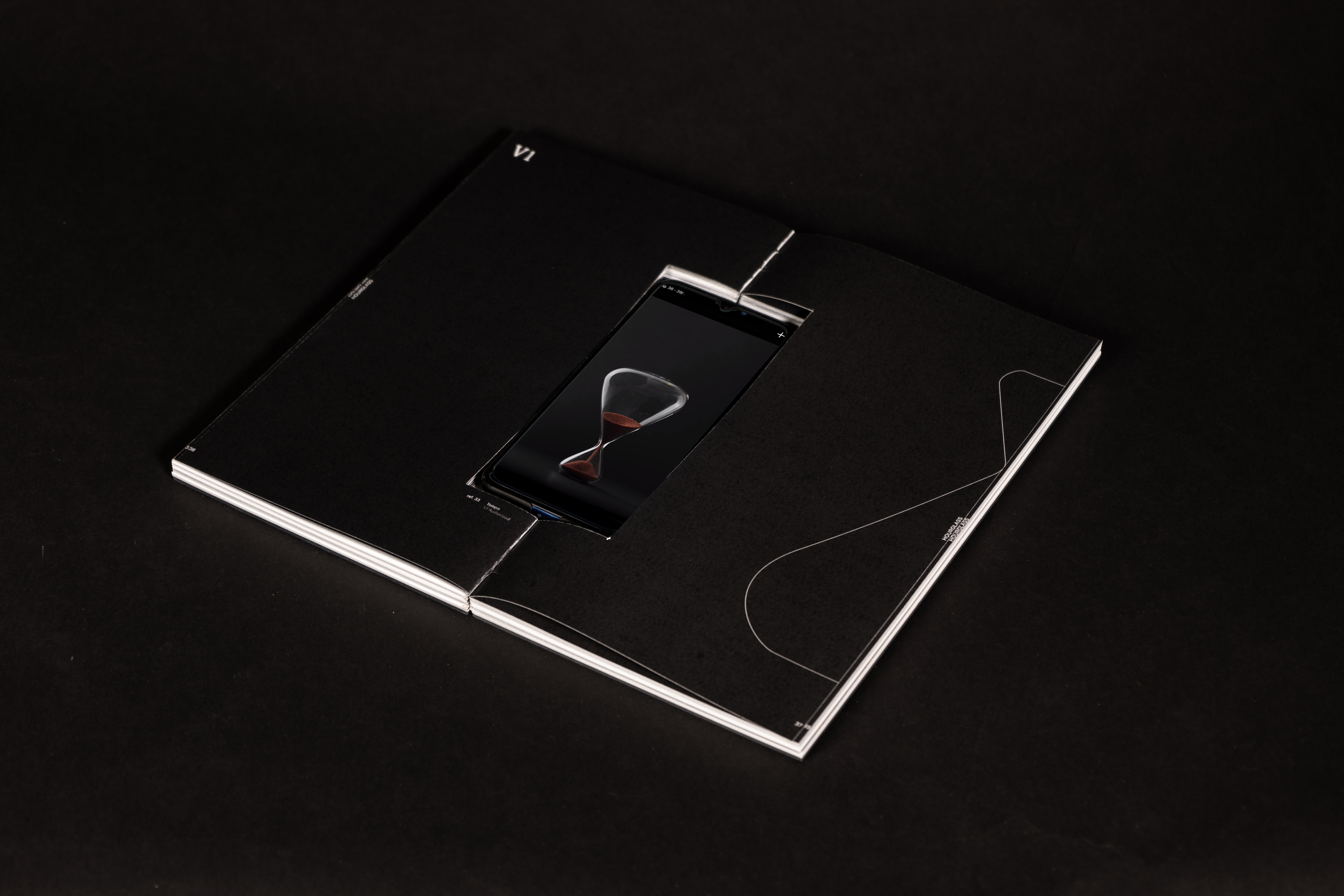
V1. "Everything may seem little and little may seem too much."
Time plays based on its context and the clock shows
it clearly. Do you feel like going to the beach for 8
hours on a summer Sunday? And if we are going to work for the same 8 hours? Surely your answer
would not be the same but calm, it is normal. The
perception of the quantity always varies if the contai-
ner changes.The so common joke of the half-full or
half-empty glass is nothing more than simpli cation
to the absurdity of a vast concept.The truth is that
there are no certainties, no absolutes. And in time it
is very evident. A blinking second is eternal, a 60th
of a minute begins to stop having value, in a day it
may seem little, but in a week it is even less, and in a
month it is practically not counted.
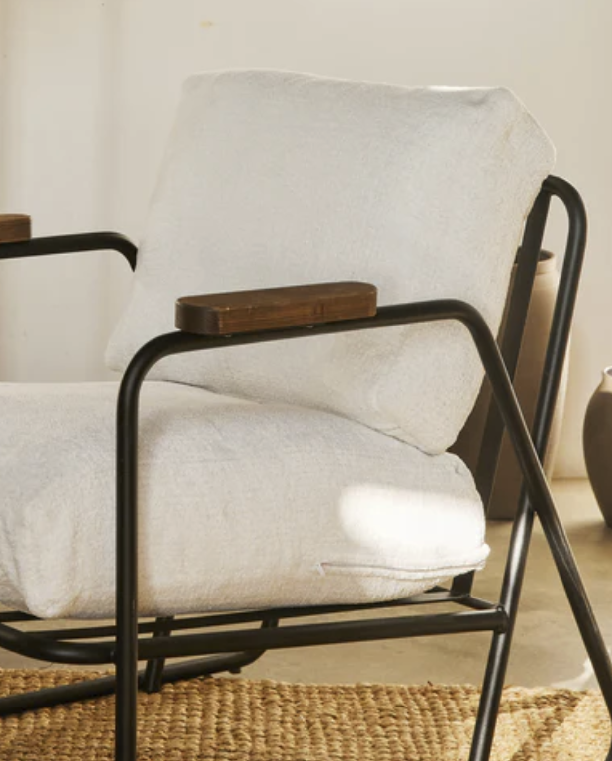
V2. "He took a breath then continued quickly, that step back let him to fly”
Obligate to take your time, it is shown that we are more
effective in our actions when the body and mind have
taken that breath.When the clock has spent all its time
it will stop, just like you when you consume all your
energy, stop. Stop and look around, the clock asks you
for time to recover, I repeat, just like you.The clock
dancing on itself, the time spinning, motionless and
restless. He can’t stand like this forever, and he needs
you to stabilize.

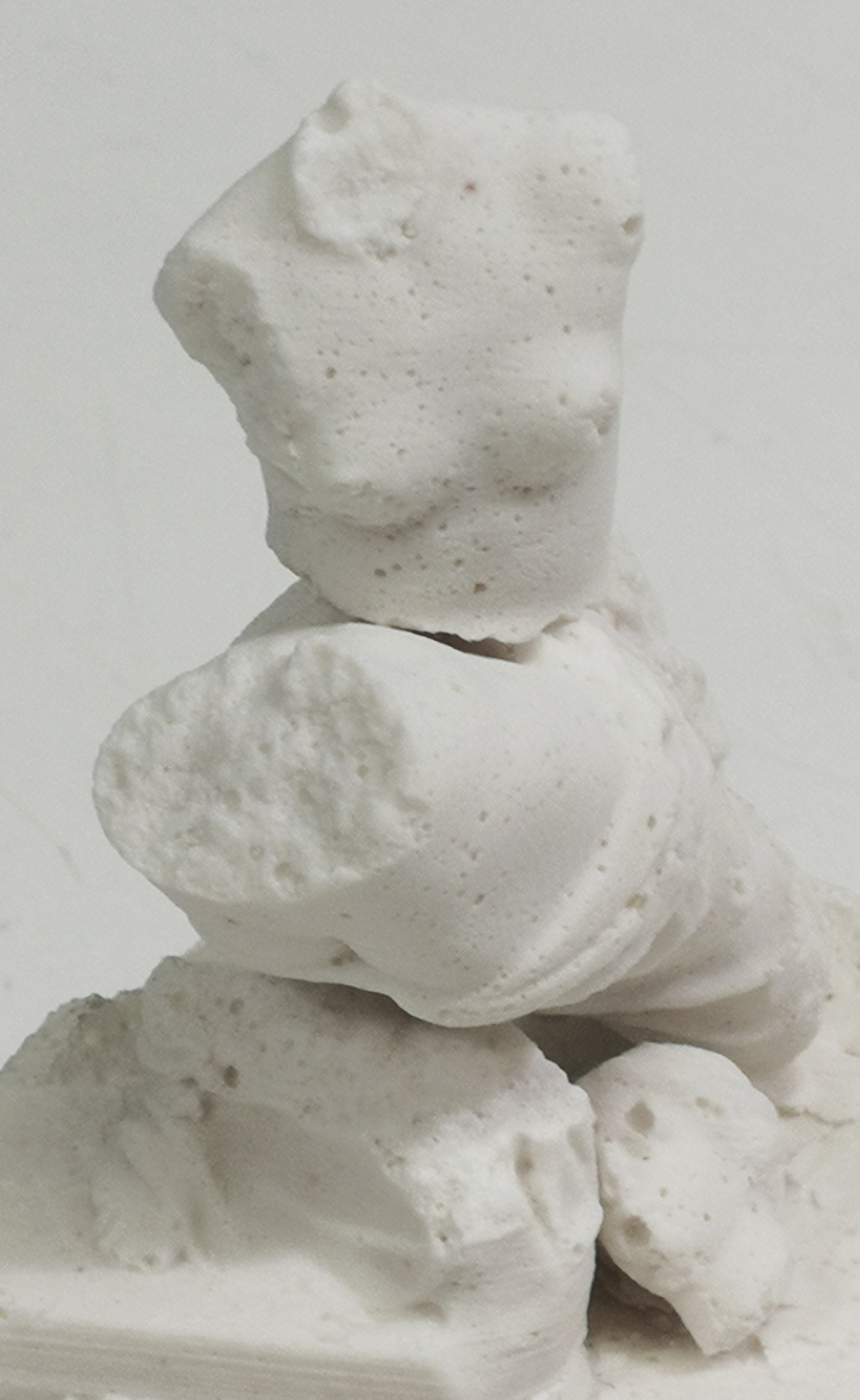
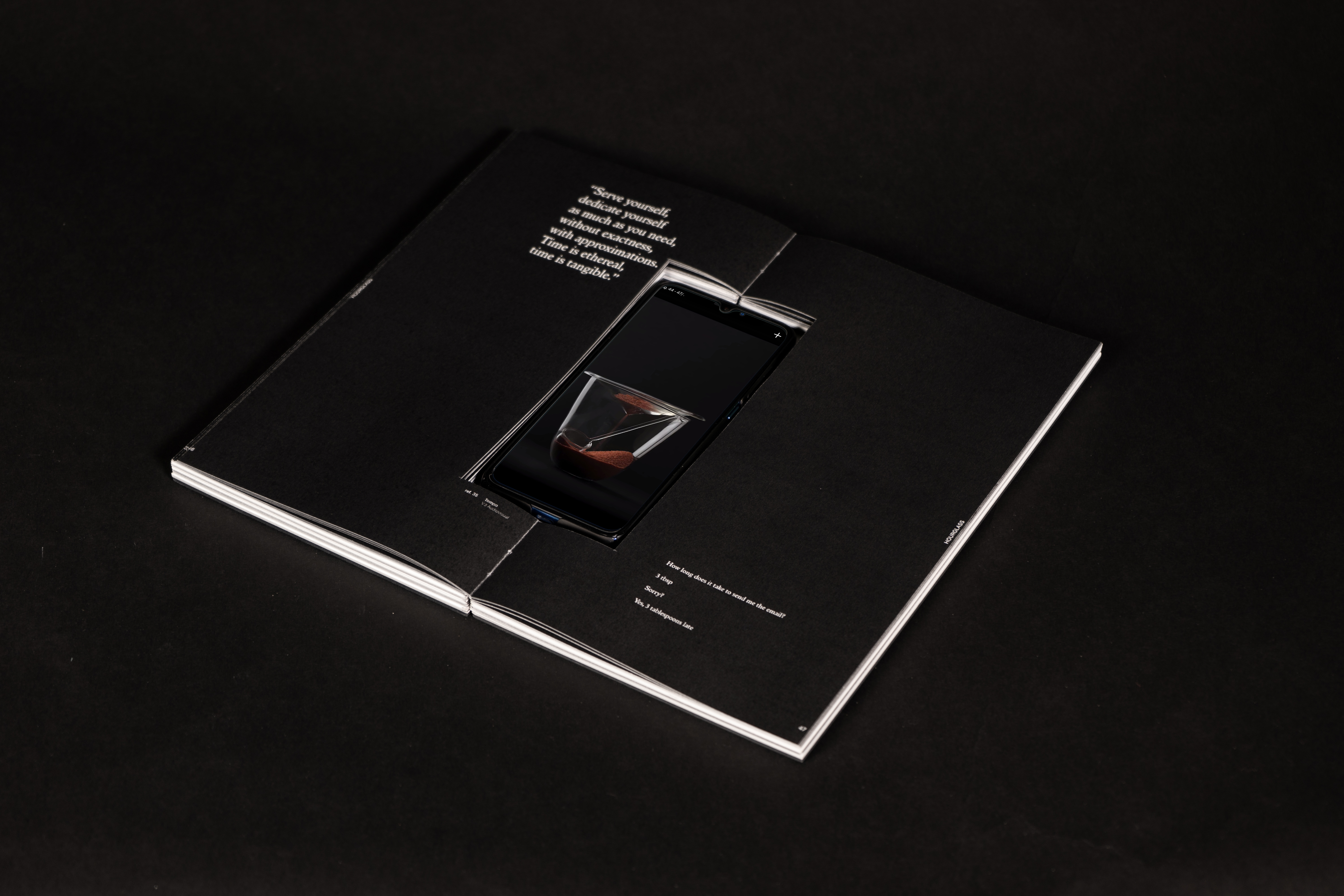
V3. "
Serve yourself,
dedicate yourselfas much as you need,
without exactness,
with approximations.
Time is ethereal,
time is tangible.”
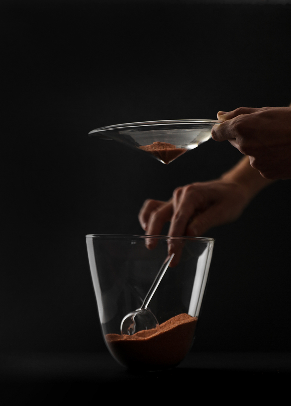
How many time do you need? 3 tbsp
Take the time that you need

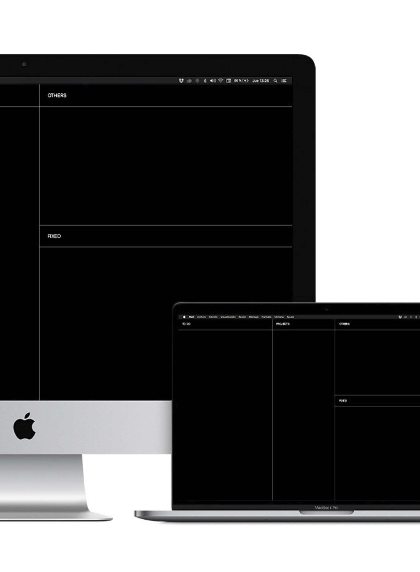
GRAPHIC DESIGN
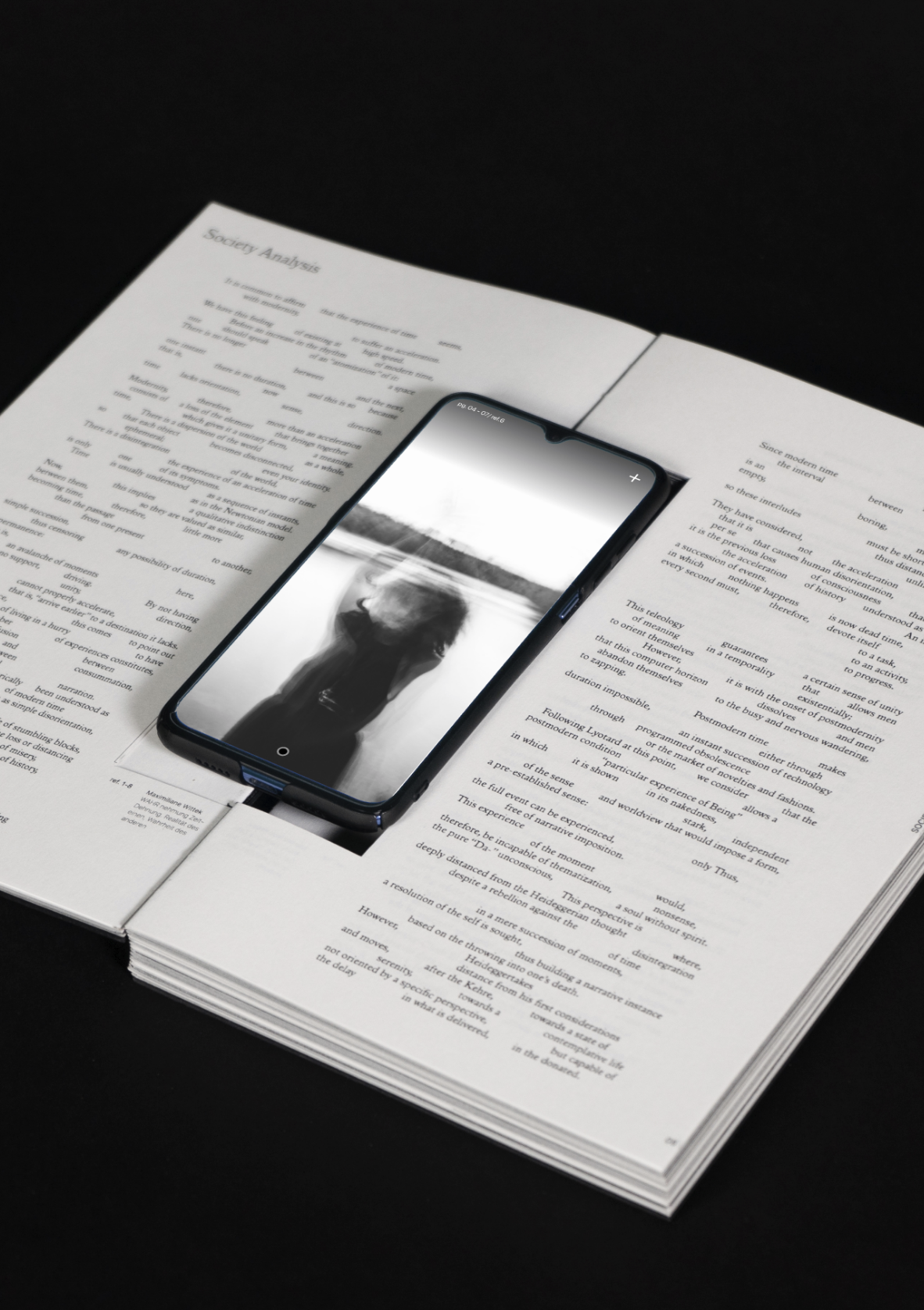
To bring together all the reflection, justification, research, conceptualization of the Tempo project, we have designed a somewhat special book. This book is not only a compilation of the work done, but it is also a piece of reflection on time. A guided reading rhythm has been generated through the graphic decisions made.

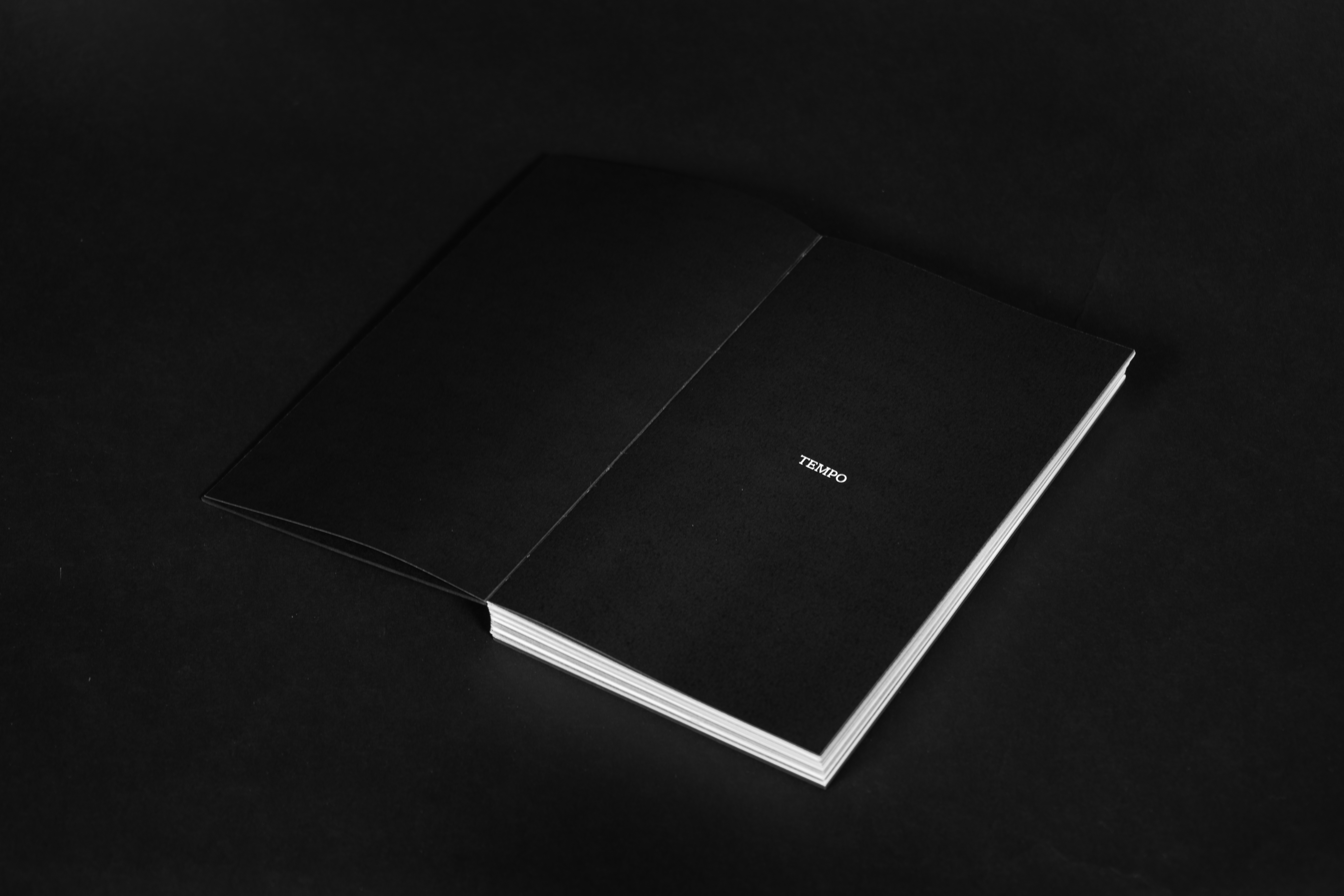

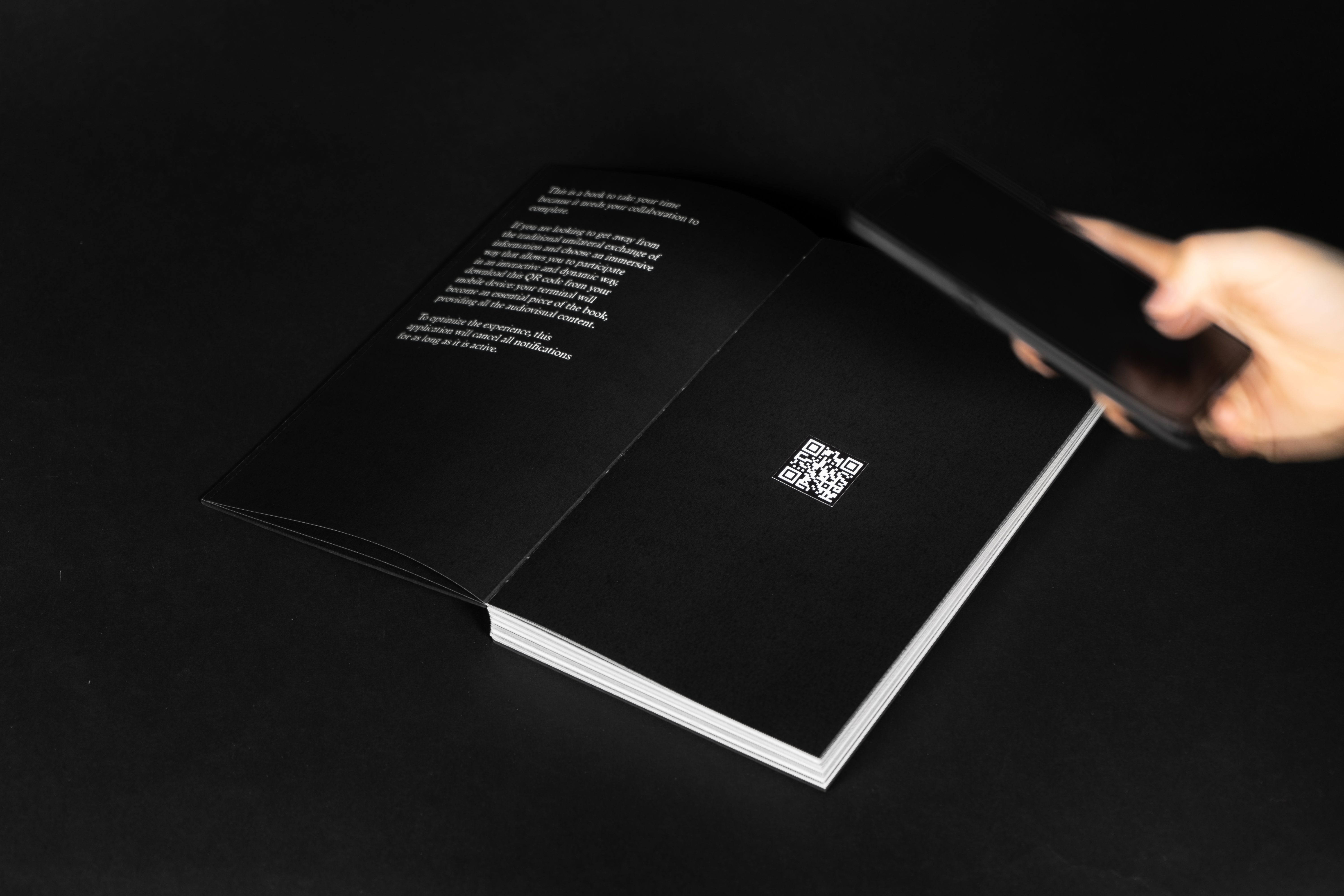
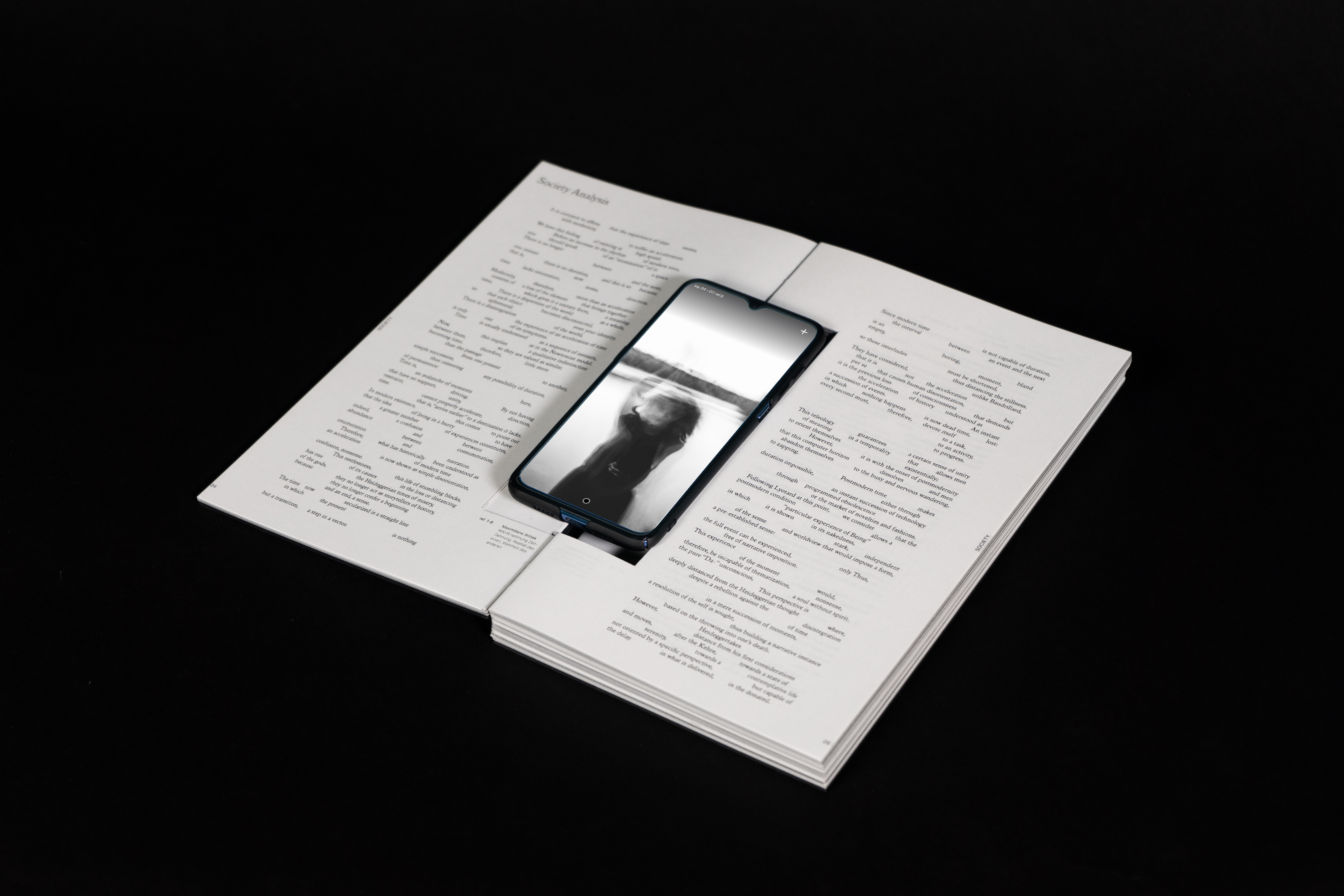


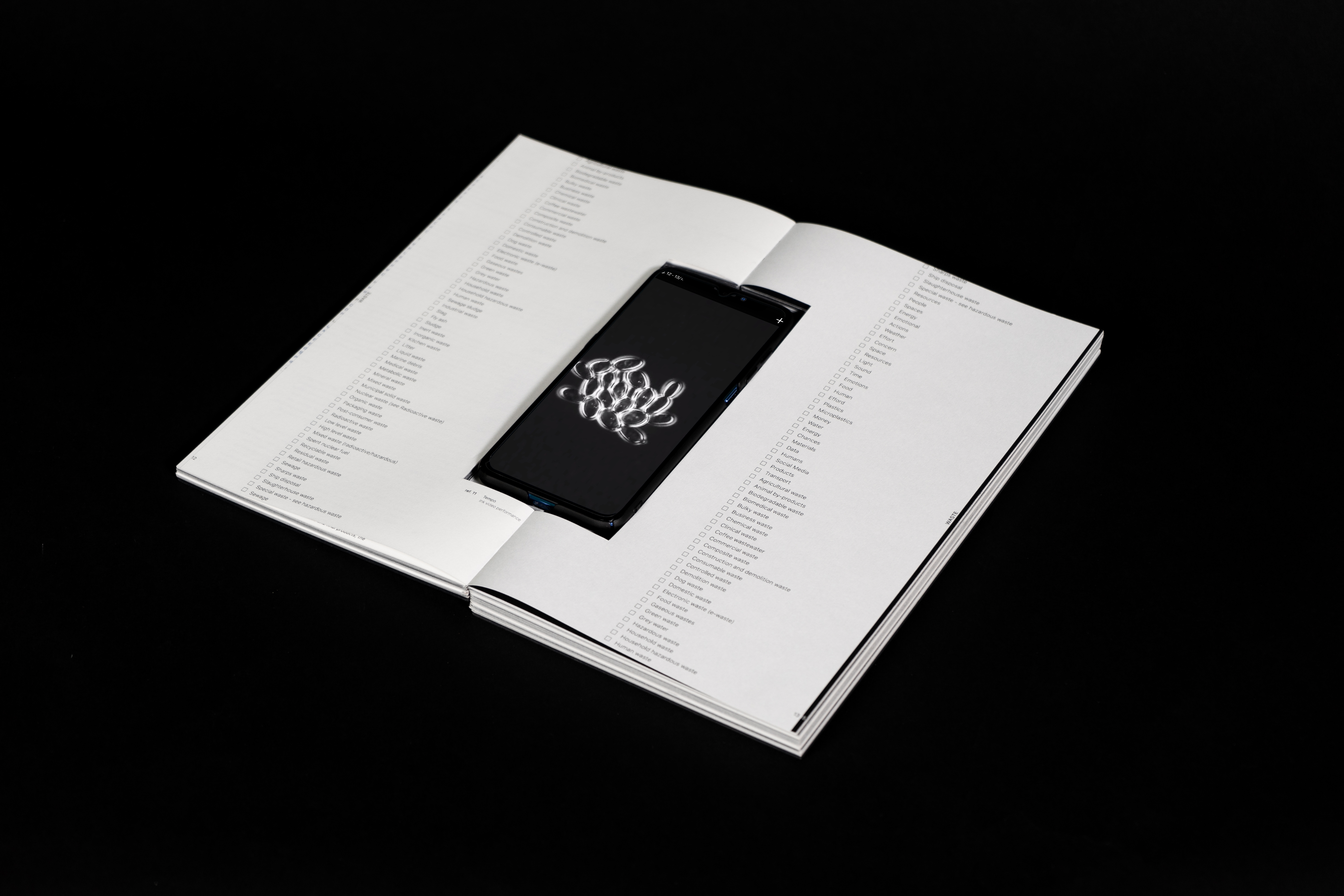


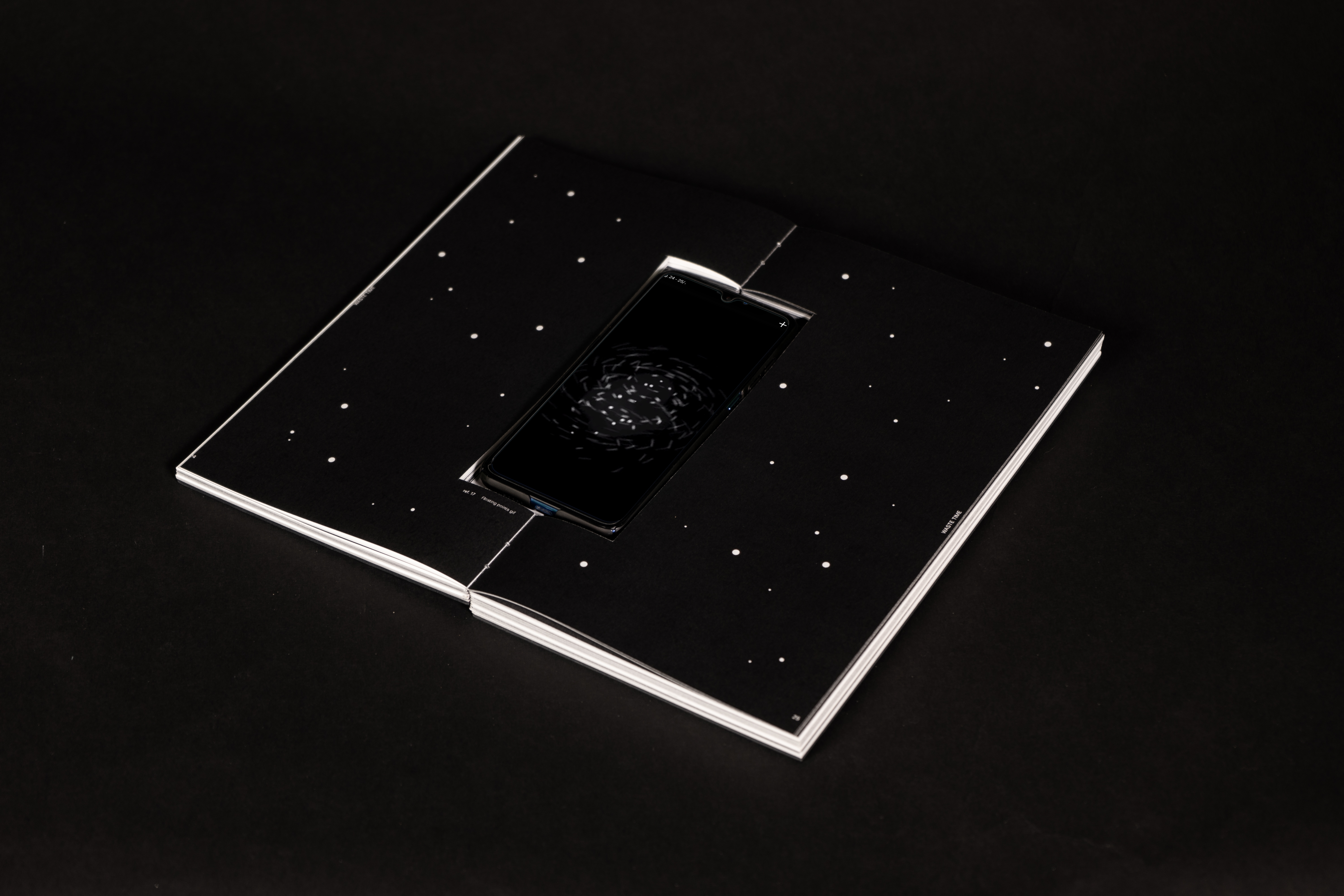

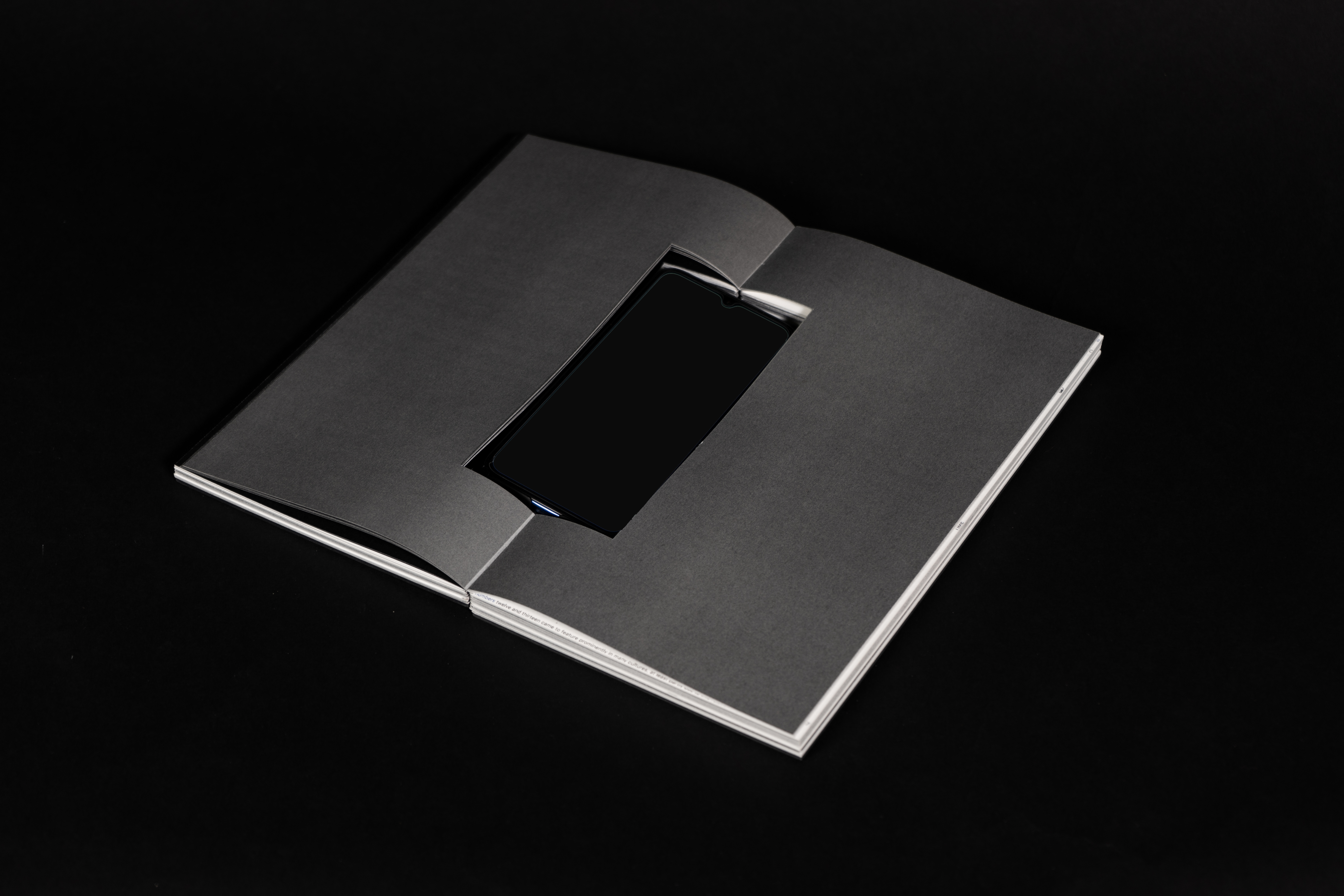

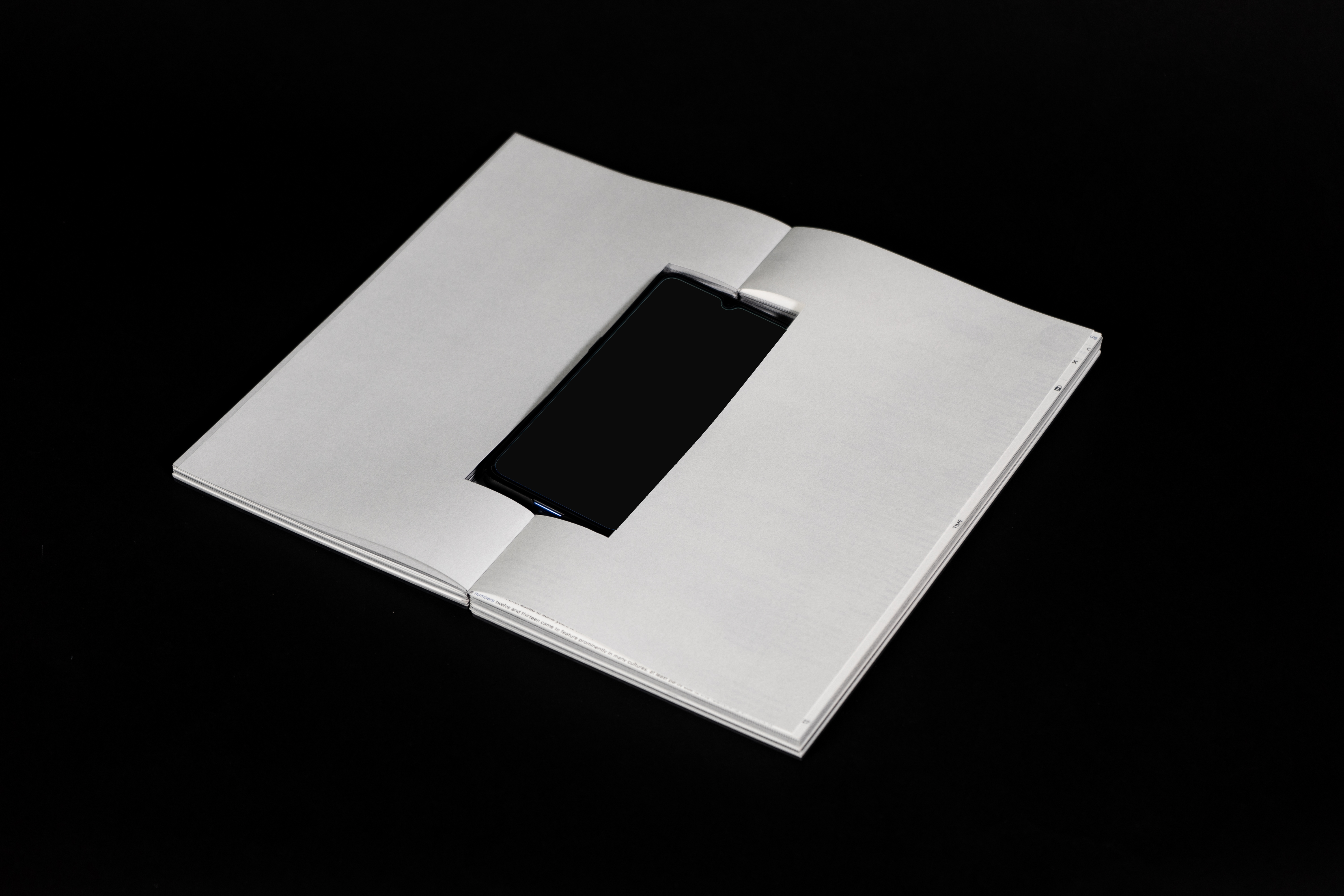


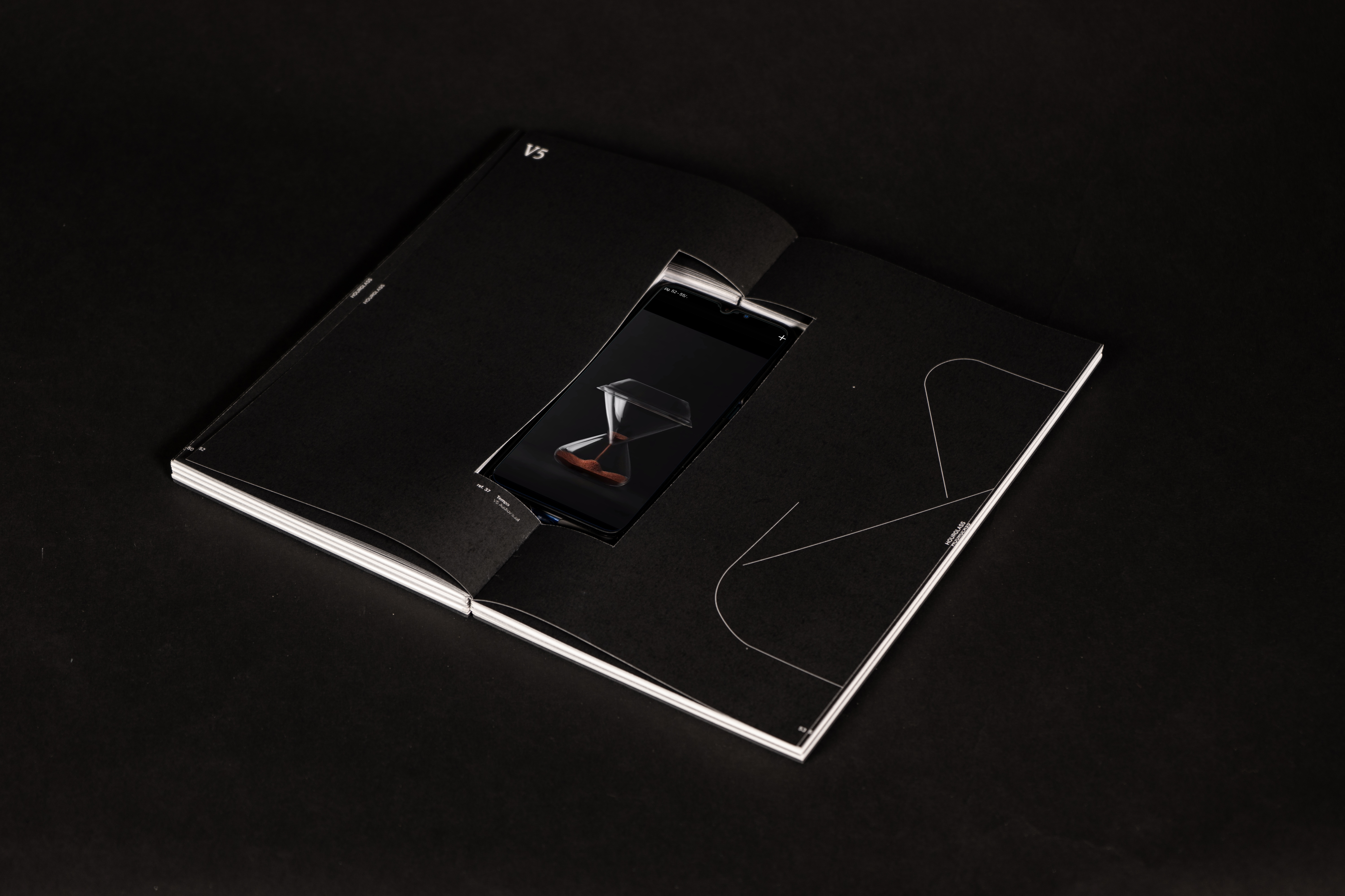

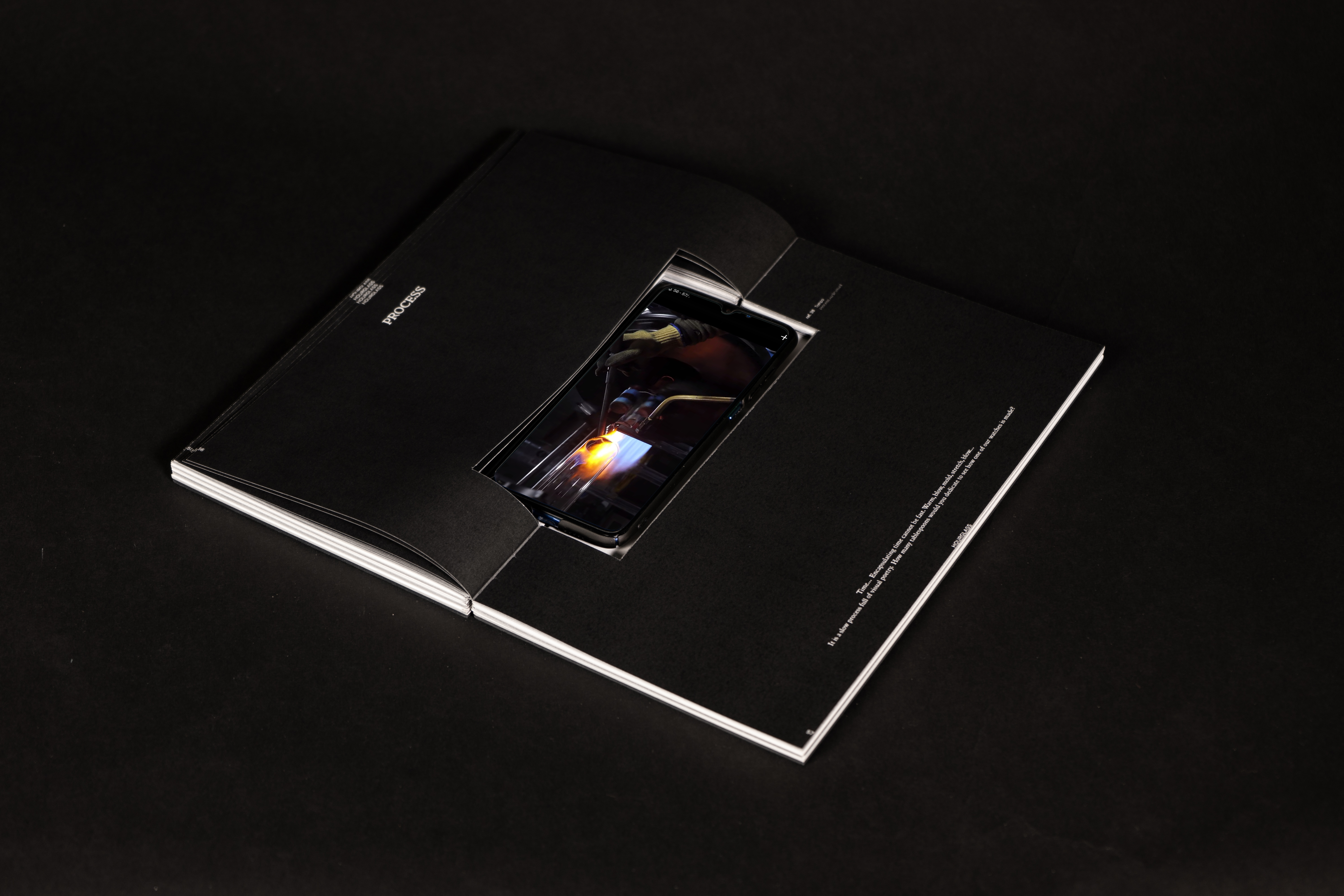
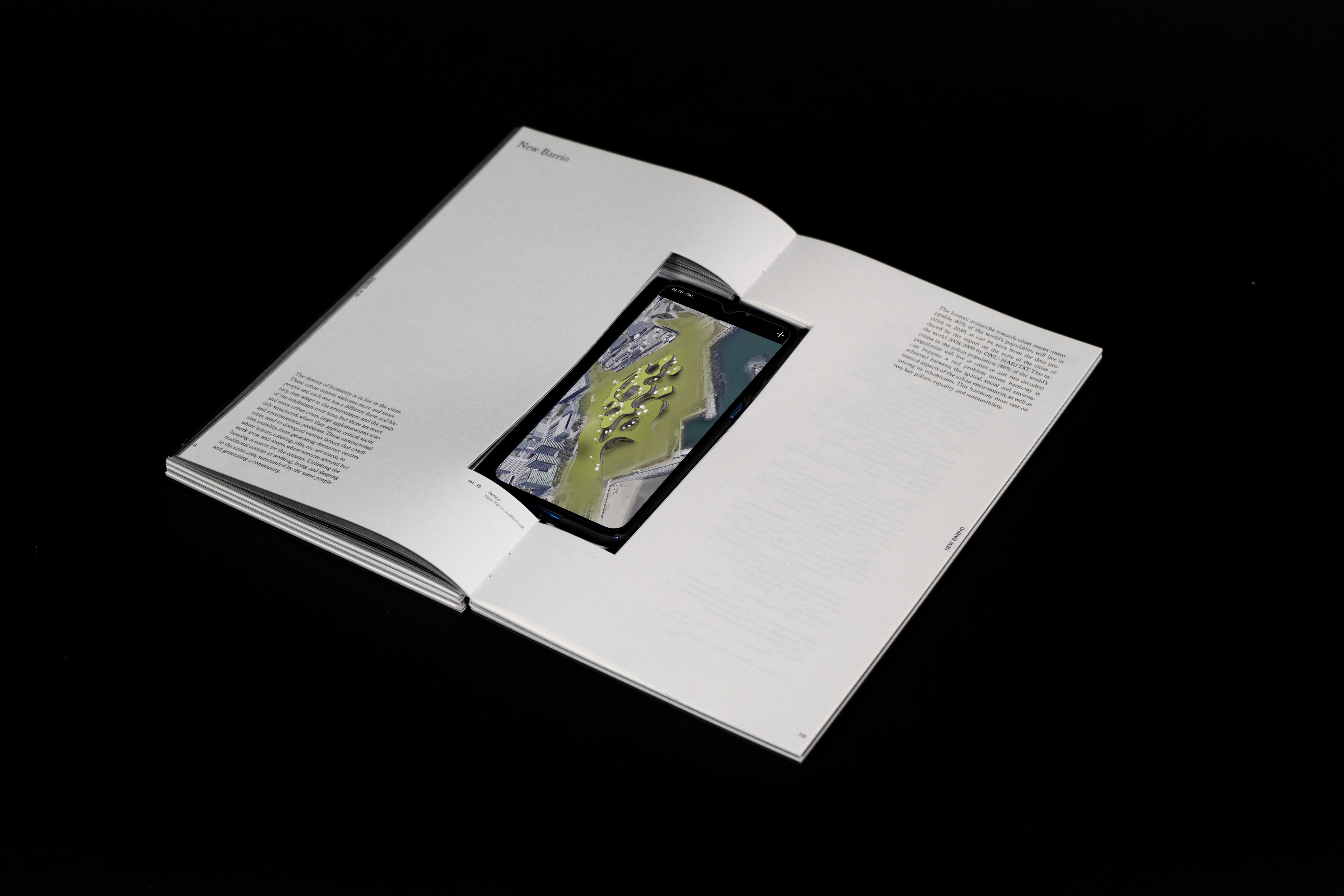


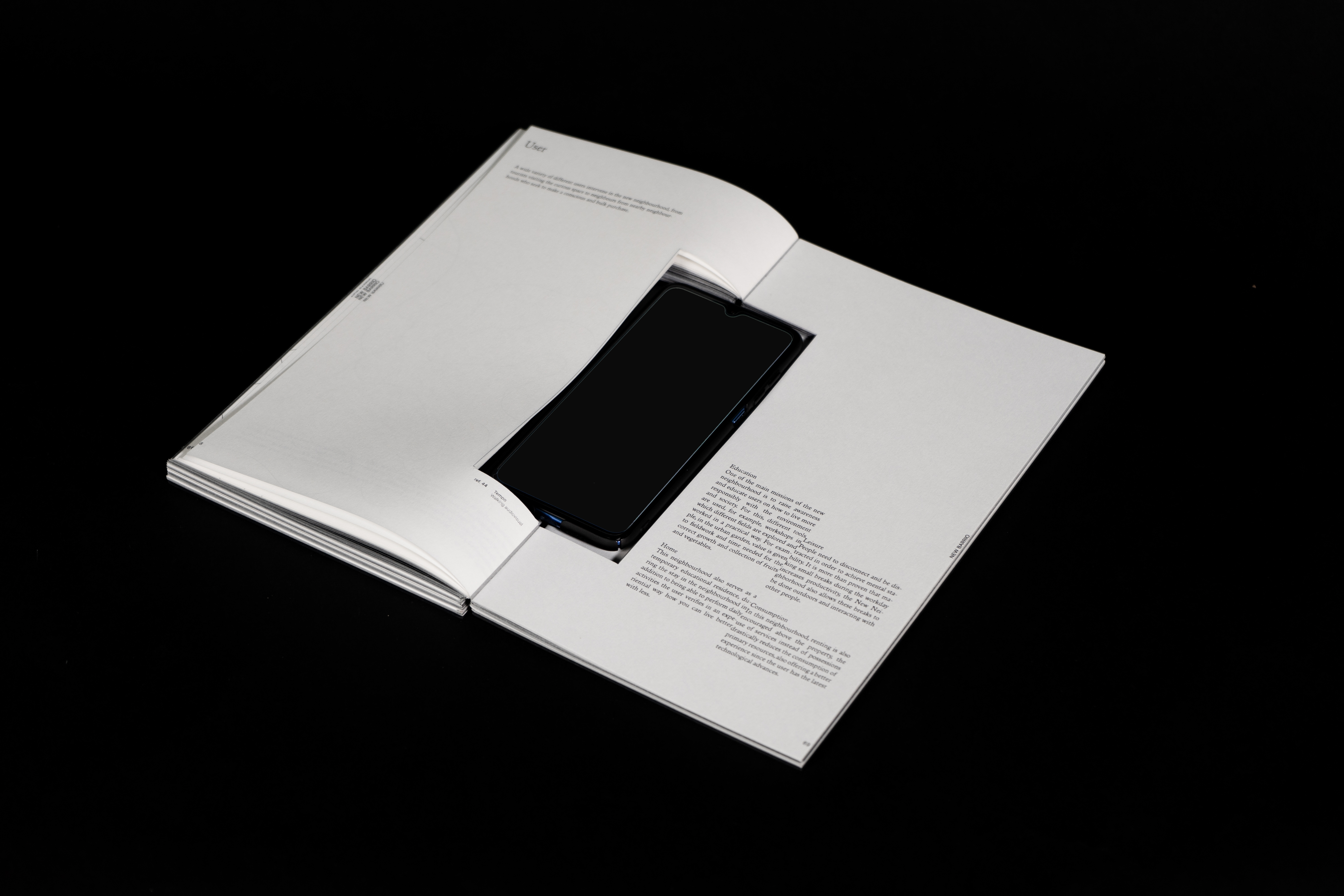

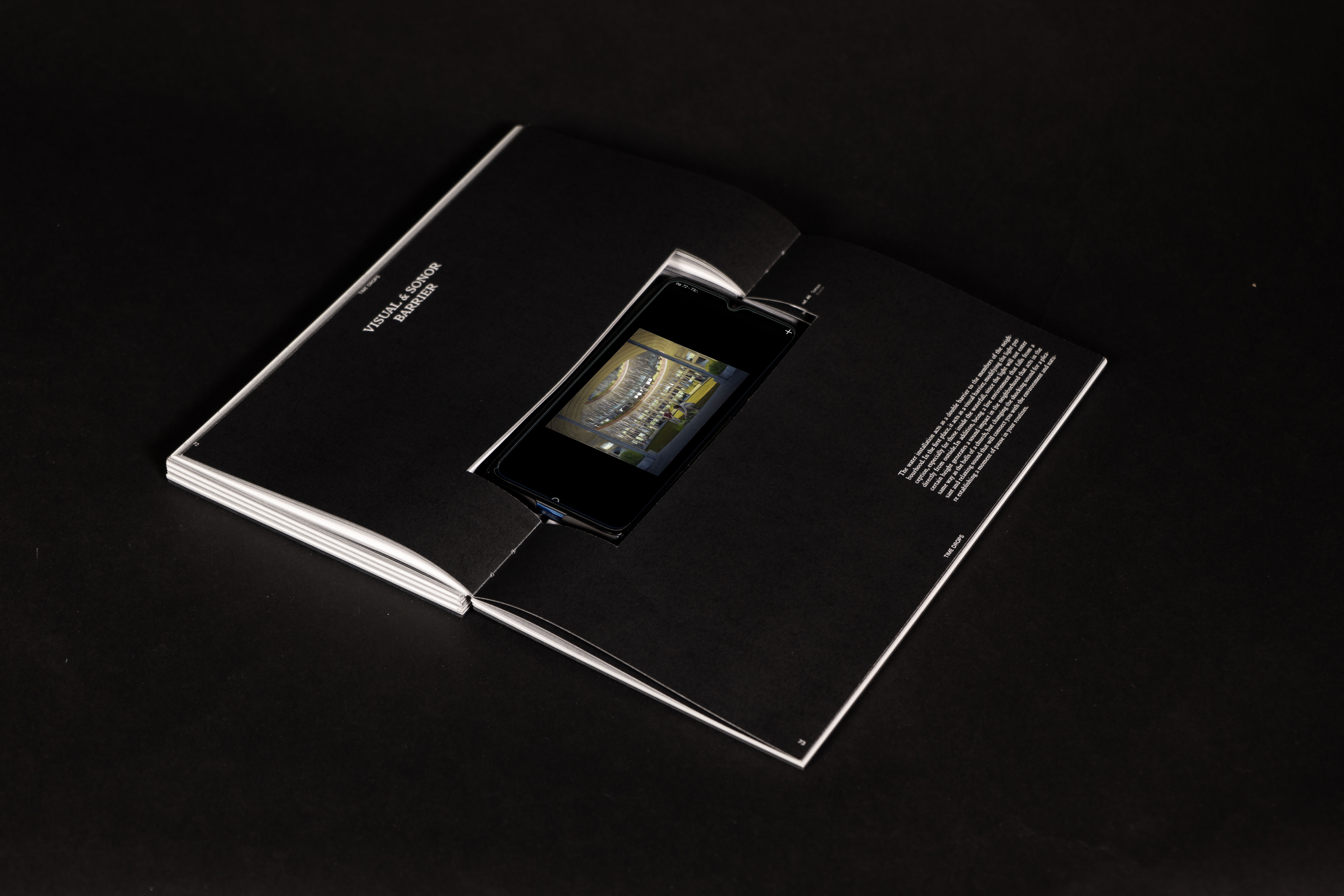
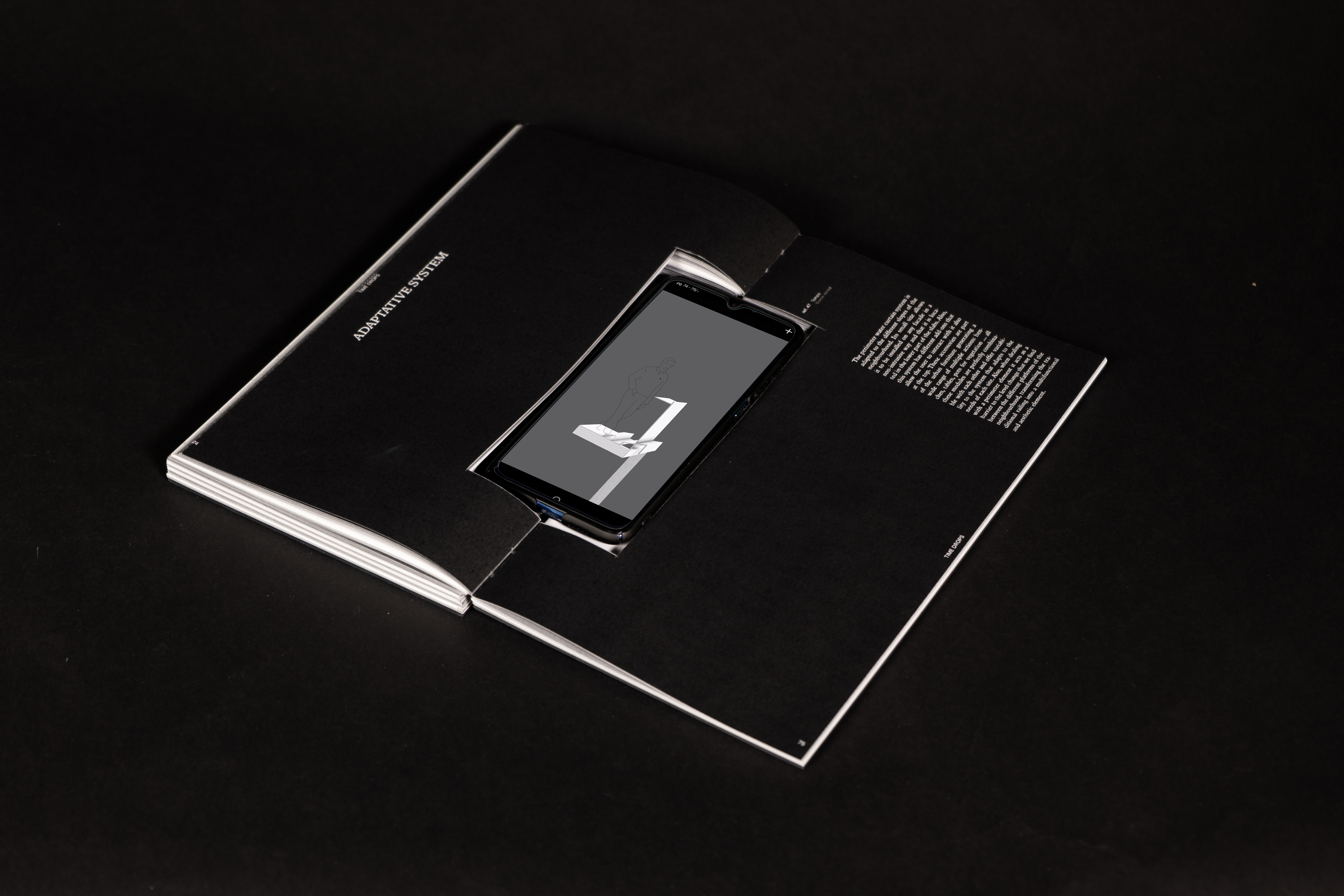
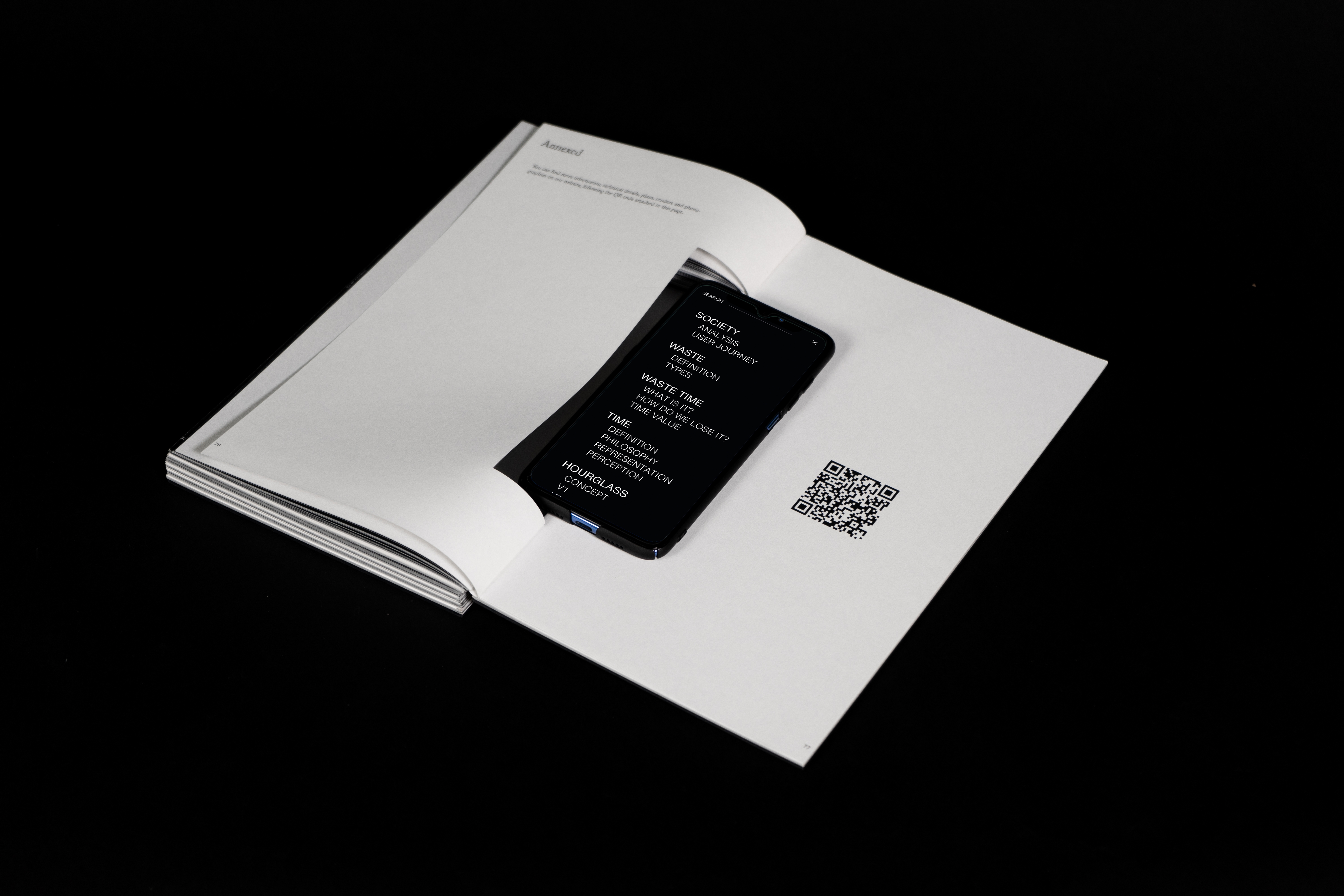

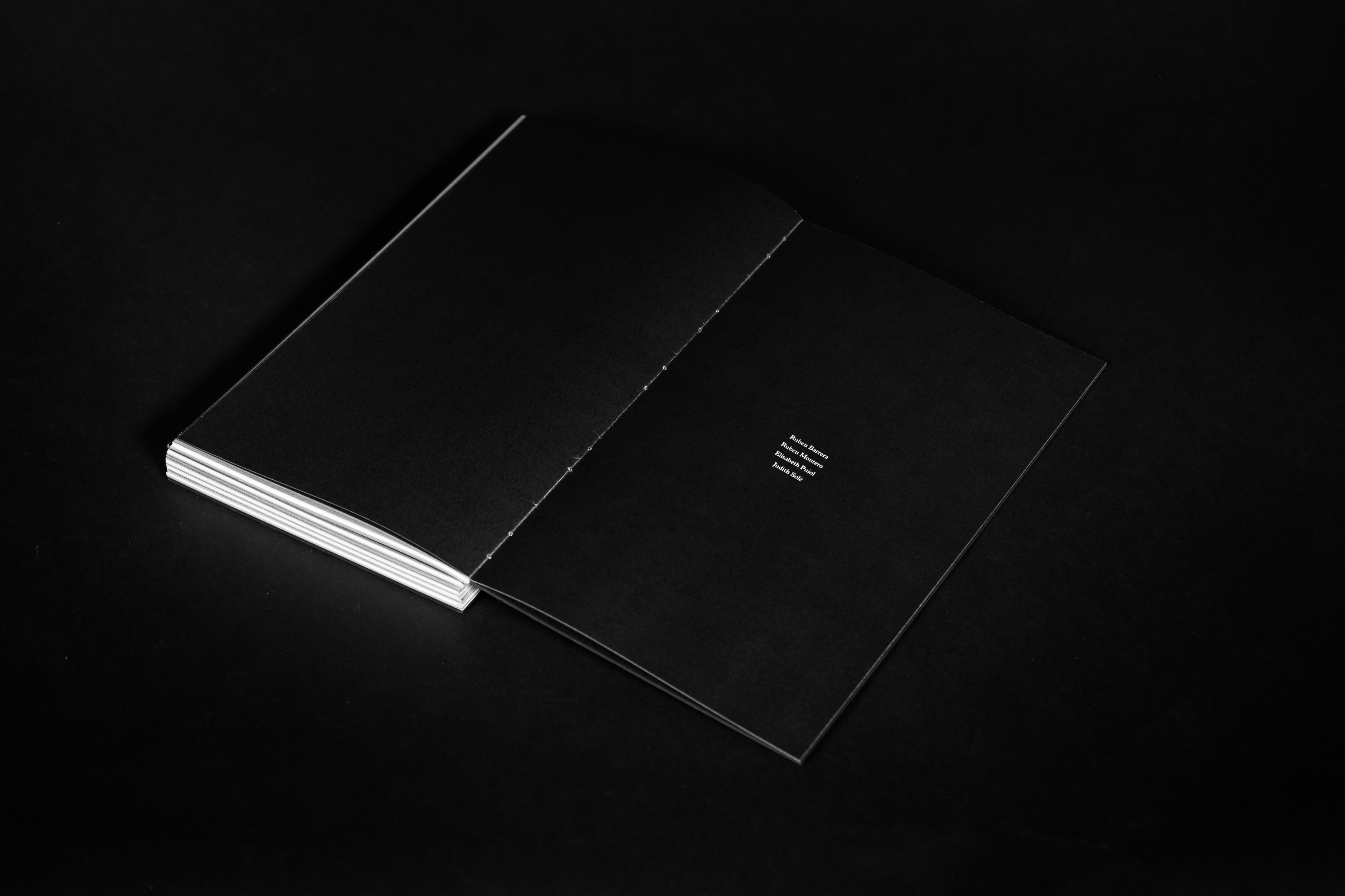
It is a book full of text, with no content other than graphics. To begin with, the QR code is scanned to open a mobile app with all the audiovisual content of the book inside. The mobile device is placed in the prepared space between pages. While reading the book, you will receive instructions to navigate through the mobile app. This allows for a richer reading experience since visual information provides more than what can be offered on paper. The book is in grayscale, and between sections, you can see a transition with the "fade-in" effect generated with the printing ink itself. These transitions throughout the book, allow a space for reflection, and a pause to continue reading later.

The graphic style of the layout is a relaxed grid with a lot of visual pauses. For some more thought-provoking texts, a peculiar method has been used to put them on paper; this method is based on creating more or less long spacing between words as they would be spoken in a recital. We have used this tool to help the reader dive into the reading and generate a mental recital inside him/her during the reading.
Three main typographies have been used: "Italian Old Style" for titles and highlights, a type with character and strength, although at the same time elegant and subtle; For texts we have used "Italian Old Style", which offers a relaxed and understandable reading for the reader; And finally, there is "San Francisco" font, used for direct references to the mobile app. It generates a direct link between the book and the app since both use the same typography.
Make introduce their phones (temporary distraction technology) into the book changes the problem to an improvement.

Graphic design works acording as take your time for read and for meditate about each topic that appears


MAKING OF